17 Years of the Flag of the Republic of Macedonia
 October 5th marked the 17 years of the adoption of the new flag of the Republic of Macedonia. The author of this flag, Miroslav Grcev tellsabout the situation and process of the design and adoption of this flag.
The text of the English Heradld number 5 given in full
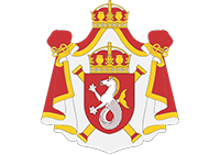
By the end of the summer of 1995 I was hired by the Government of the Republic of Macedonia to make a study, along with a graphical solution for a new state flag. The plan was to come up with several different ideas for the new flag in the first phase of the study, from which – in collaboration with the client –one would have been chosen which would have been acceptable for all actors on the political stage at the time. As a result of this study, a graphical solution of a new state coat of arms should have also been created, whose adoption by the Assembly, as an obligation from the Constitutional law, was already several years late. In an agreement with the client, the graphical solution of the state coat of arms was to be a secondary “product” and it had to contain the same motif and stylization as the flag. The work had to be done in an indecent amount of time, less than a month, and the political atmosphere in which the negotiations for the Interim Agreement with the Hellenic Republic (Greece) were held required that all the work was to be done in complete discretion. The coordinator of the project and the “program director” who made the decisions in the name of the client was the Minister of Internal Affairs at that time, Ljubomir Frchkoski.
The framework
The most difficult part in determining the project framework was to avoid the frustration over the political pressure about changing the national flag, and the negative definition of the new design: it had to differ significantly from the previous one. On the other hand, the most important thing for a successful design was to provide the invariables which would secure the thematic, visual, symbolic and identity continuity with the previous national flags. These decisions were considered as ‘conditio sine qua non’ of the search of a new flag:
1. The new flag must have the same colors as the previous national flags – a blood-red base with a golden-yellow application, and
2. The new flag had to include the graphical symbol of the sun as a unique application.
The persistency of the symbol of the sun as a unique motif on the new national flag was to provide symbolical continuity with both the Star of Kutlesh (from which the new sun had to be different), and the five pointed star (which is, not to forget, a star just like the sun is) with which the modern Macedonian state was born some fifty years ago.
Searching for the new sun
 I started the graphic research by examining all the vexillological solutions which include a graphical interpretation of the symbol of the sun. In spite of the widely distributed opinion that the solution must be a product of an original and never-before seen creation, the new Macedonian sun has emerged from the analysis of the most successful graphical stylizations of the sun, used in the national flags from recent world history, and the evaluation of which design would provide a painless acceptance by the citizens of Macedonia. On the other hand, browsing for a stylized inspiration from the recent vexillological past, I wanted the new state symbol to have history already at the first day of it’s new birth, and also to respect identity continuity. It was only possible that I adopt and adjust a graphic solution which is used in the symbolic language of heraldry and vexillology for a long time, and which the citizens are used to, even if subconsciously.
 Twelve possible solutions arose from the research, flags with a central sun motif, which can be divided into four stylistic groups, depending on the way of artistic interpretation of the sun symbol. The first one was a group of sun discs without rays, like the flags of Japan, Korea, Bangladesh, Niger, Laos and others; then, suns with triangle rays separated from the disc, such as the flags of Taiwan, Kazakhstan, Malawi etc.; the third group was comprised of suns with medieval wavy rays like the ones on the flags of Argentina, Ethiopia, Malaysia, Uruguay etc.; in the end, suns with rays radially spreading from the disc like the flags of the Phillipines, Arizona, Tibet and others.
 I produced the graphic solutions in one sample per proposal, as presentation maquettes, in collage from cut adhesive colored foil on carton paper. They were made in a composition format of 1 : 2, and the coat of arms was designed in a heraldic graphic language, on an Old French escutcheon, also known as a classical shield.
 From all the variants made with a professional’s equidistance, the one that grew up to my heart was, undoubtedly, the most original and most avantguard solution, made on the basis of an idea by my friend by ink and pen, Lazo Plavevski. It was a round sun disc whose diameter was larger than the height of the flag, so that the disc “exits” the flag, thus creating a dynamic impression of the sun’s expansion and dividing the flag in a three-field format. Of course, this personal favorite, as well as many other suns, was discarded after two subsequent selections, after which only suns with continous radial rays spreading to the ends of the format were left. I think that the clutch point in the choice of the sun with radiant rays was that this stylization had the most chances of mass acceptance, since the same representation of the sun shines on our state emblem since 1946.
Formation of the sun
with radiant rays
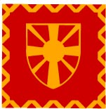
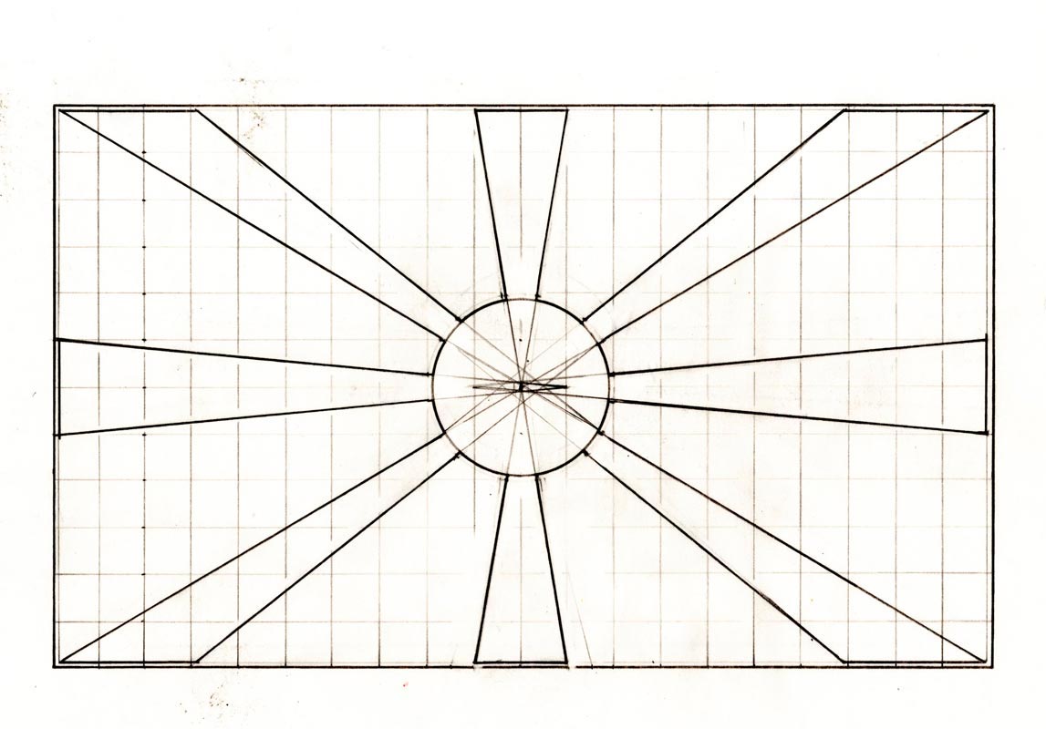
 The chosen graphic interpretation of the symbol of the sun with eight radial rays was to be formed into a definite graphic solution. The first works had a sun with four wide orthogonal and four narrow diagonal rays. This cross-shaped variant of the sun came out intuitively from my hands out of the fact that the hierarchization of the rays had structurized the composition of the flag. It “held” the format better. But, the cross-shaped stylization gained Christian connotations, and the coat of arms looked like the escutcheons of the Templar crusaders, which was totally unacceptable for our multicultural state. In the end of the design process, it was clear that the rays must have equal width, and they must give out an impression of symmetry, radialness and harmony. However, the solution has integral structural problems, because if we consistently implement the principle of the diagonal rays, the flag composition completely changes with the change of it’s format (in different applications). This integral weakness of the radial stylization comes because of the discrepancy between the symmetrical circular shape of the sun (from which logically emerges the central symmetrical nature of the radiant rays) on the one hand, and the asymmetry of the rectangle, on the other hand. Even more, this asymmetry is augmented by elongation of the format, and so the sun is even more deformed. I solved this structural compositional problem of the radiant sun with two interventions: the first one being the adoption of the 3 : 5 format, or in the end 5 : 8, which is an approximation of the “golden ratio” in which the sun is much less deformed than in the 1 : 2 format. The second “invisible”, but essential constructive intervention is the displacement of the rays’ center, thus creating more centers distributed along the perimeter of a small regulatory rectangle in the disc with the same “golden ratio” of its sides. Being structurally and compositionally edited like this, the sun radiated with harmony and freshness which was supposed to overcone the expected inertia and resistance on the path to its adoption.
Adopting the flag with a fault
 I handed over the graphic solutions of the national flag and state coat of arms, produced in one sample – as maquettes, to the President of the State, Kiro Gligorov at the end of September 1995, one day before the initially scheduled session of the Assembly of the Republic of Macedonia, at which they would have been adopted. Session of Parliament was postponed – apparently because the night quarrel about national symbols among political participants in the Parliament, and several days later, after the adoption of the new national flag, I was surprised to find two things: first, the coat of arms has not even come up on the agenda, and the second that the adopted design was not the balanced final version in the “golden ratio”, but the first raw solution in the 1 : 2 format. Moreover, someone, evidently at the last moment, had separated the rays from the sun’s disc, and left them cut away, spreading as planks. It was clear to me that the adopted design was a “victim” of an overnight “political debate” in which the “compromise” was an evident and ignorant uglification of the graphical solution, realised that night “on the fly”.
Ever since that October I am carefully following the situation, and I’m waiting for the moment when there will be born a consciousness of the need of a technical, practically aesthetic, correction of the national flag, and it’s artistic harmonization. I am waiting for that moment persistently and unhesitantingly, even though I note that an aesthetic correction, as a curse or faith’s spite, has as little chance to gain political support, as much as, from an expert’s point of view, it is more logical and necessary.


